How to use Podium Browser dynamic components
You may have already noticed the little green logo on the bottom left corner of the images of some components in the SU Podium Browser.
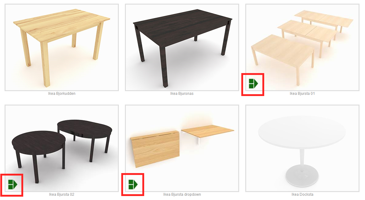
This dynamic component logo indicates that the item has special options that you can customize. Dynamic options range from simple on/off switches for lights, to complex sets of parameter to completely customize the size, shape, and look of the Browser item. Preview images generally tell you a bit about what you can change whether it is material type, dimension, state or disposition.
Using Dynamic Components:
After downloading the object into your scene from Podium Browser, you can activate its dynamic component options using one of two methods:
Component Options Window: To open the “Component Options” dialog in SketchUp, select a model in the viewport, and then from the SketchUp menus go to Window Component Options.
Dynamic Options toolbar: You can access component options from the dynamic options toolbar:
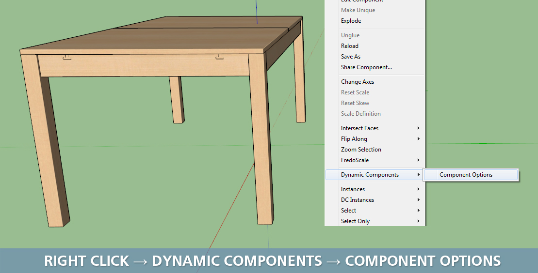
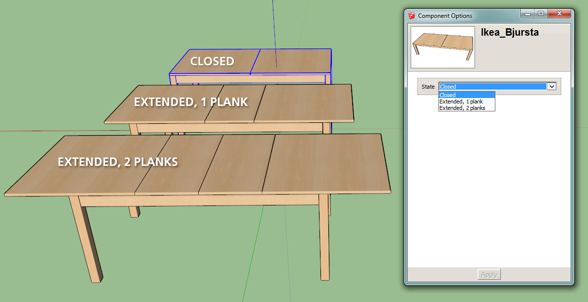
Once the window is opened: Select one of the dynamic components, change the parameters in the drop-down list and click the apply button as seen below:
Interact
Finally, a select number of Browser dynamic components can be activated using the “Interact” function accessed in the tools menu (Tools Interact).
With the interact tool activated, simply click on any model with dynamic component options to customize items on the fly:
Note: Not all of the dynamic components in the Browser have an updated thumbnail with the green dynamic component icon.
For example: All the light fixtures can be turned on/off (and many have additional bulb options), but few of them show the dynamic component icon in Podium Browser. If the preview images show more than one component it might be worth it to check for dynamic options even if there is no icon.
